Drawing graphs and charts the Cambridge waySpec S3
In short
A line graph is used when the independent variable is continuous, such as temperature, while a bar chart, with bars that do not touch, is used for categories. Put the independent variable on the x-axis, label axes with quantity and unit, use more than half the grid, plot small crosses and draw a single thin best-fit line or curve.
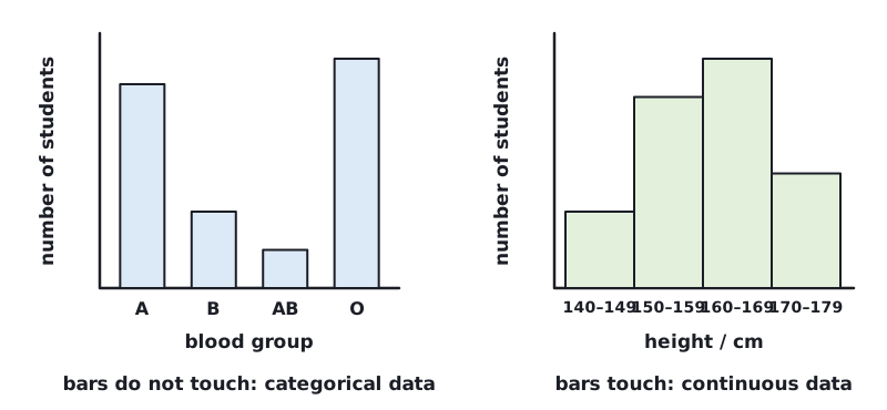
First choose the right kind of chart. The choice depends on whether the independent variable is continuous (any value on a scale) or categorical (separate groups).
| Type | Use it for | Rule |
|---|---|---|
| Line graph | a continuous independent variable, such as temperature or time | plot points, then a best-fit line or curve |
| Bar chart | categorical or discrete data, such as blood groups or species | bars of equal width that do not touch |
| Histogram | continuous data grouped into classes, such as height in 5 cm groups | bars that touch |
| Pie chart | percentages or proportions of a whole | sectors add up to 100 % |
 (opens full size in a new tab)
Rules for a line graph
- Use a sharp pencil.
- Put the independent variable on the x-axis and the dependent variable on the y-axis, unless told otherwise.
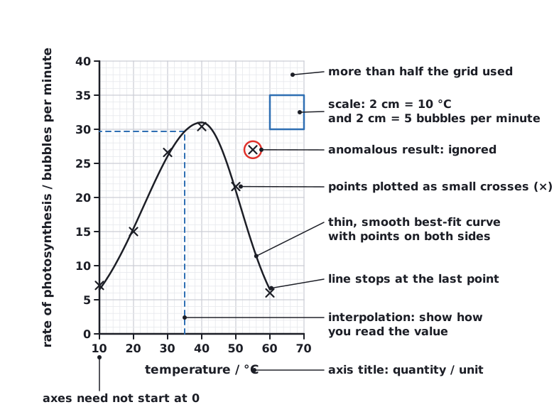
- Label each axis with the quantity and unit, using the table headings: temperature / °C.
- Choose scales that use more than half the grid in both directions, with 2 cm representing 1, 2 or 5 units (or 10, 20, 50 …). The axes do not have to start at (0, 0).
- Plot each point as a small cross (×) or an encircled dot (⊙), to within half of the smallest square.
- Draw a single, thin, smooth best-fit line or curve, with points spread evenly on either side. Ignore clearly anomalous points.
- Only draw a best-fit line if you can expect to predict values between the points. If asked to join the points instead, use ruled straight lines from point to point.
- Do not extend the line beyond the first and last points unless you are asked to extrapolate.
Choosing a graph scale
The temperature in an experiment ranges from 10 °C to 60 °C. The rate ranges from 4 to 46 bubbles per minute. The graph grid is 16 cm wide and 20 cm high, in 2 cm squares. Choose a scale for each axis.
- x-axis (temperature): try 2 cm = 5 °C. From 10 to 60 °C is 50 °C, which needs 10 squares = 20 cm. That is too wide for a 16 cm grid.
- Try 2 cm = 10 °C. From 0 to 60 °C needs 6 squares = 12 cm. This is more than half of 16 cm, so it is acceptable.
- y-axis (rate): try 2 cm = 5 bubbles per minute. From 0 to 50 needs 10 squares = 20 cm. This fills the grid.
- Reject 2 cm = 20 bubbles per minute: 0 to 60 uses only 6 cm, less than half the height. Reject 2 cm = 3: it is an awkward ratio that makes plotting and reading hard.
Answer: x-axis: 2 cm = 10 °C. y-axis: 2 cm = 5 bubbles per minute.
 (opens full size in a new tab)
Reading and describing a graph
Read values to within half of the smallest square, and draw lines on the graph to show how you read them. Interpolation means reading a value between plotted points. Extrapolation means extending the line beyond the plotted points to predict a value. For a straight line, the gradient = change in y ÷ change in x, which gives a rate.
To describe a graph, give the overall trend, any change in trend or peak, and quote data with units, for example 'the rate increases from 10 °C to a maximum of 31 bubbles per minute at 40 °C, then falls'.
Written and checked against the Cambridge IGCSE Combined Science (0653) specification · Updated October 2026